Power bank 20000mAh 45W con cavi integrati: MAXI SCONTO Amazon (-41%)
Il power bank da 20.000mAh e 45W di Baseus è una soluzione potente, comoda e universale adatta a tutti i tuoi dispositivi elettronici, da usare quando hai bisogno di una ricarica immediata. Oggi è in offerta su Amazon al super prezzo di soli 29,74 euro invece di 49,99: include la spedizione Prime per gli iscritti.
Acquista il power bank su Amazon
Questo power bank è dotato di ricarica rapida PD3.0 e QC4 che, in termini pratici, significa portare un iPhone 16 Pro Max al 55% in soli 30 minuti, così come per il Galaxy S25 Ultra. La ricarica si completa dunque in pochissimo tempo, anche per tablet o piccoli laptop. Puoi anche ricaricare fino a quattro dispositivi insieme grazie ai due cavi USB-C integrati, una porta USB-C e una USB-A.
Con la capacità da 20.000mAh sarai in grado di ricaricare uno smartphone top di gamma per almeno tre volte e un tablet per quasi due volte intere. Compatto, resistente e sicuro, è dotato di protezione da surriscaldamenti, cortocircuiti, sovraccarichi e perfino una modalità a risparmio energetico per ricariche più leggere, come quelle di auricolari e smartwatch.
Acquista il power bank su Amazon
Un accessorio veloce, potente e completo per la ricarica on-the-go dei tuoi dispositivi: acquistalo adesso a soli 29,79 euro.
Questo articolo contiene link di affiliazione: acquisti o ordini effettuati tramite tali link permetteranno al nostro sito di ricevere una commissione nel rispetto del codice etico. Le offerte potrebbero subire variazioni di prezzo dopo la pubblicazione..bmaff_error { display: none !important;}Scrivania in ordine: la guaina per cavi più venduta è in OFFERTA
Gestire i cavi sparsi sulla scrivania o dietro al mobile TV può diventare un vero incubo. Con la guaina self-closing di Alex Tech, da 19 millimetri di diametro e 7,7 metri di lunghezza, puoi finalmente dire addio al disordine e creare uno spazio ordinato ed efficiente. È la più venduta su Amazon e oggi la trovi in offerta a tempo. È caratterizzata da una struttura autoavvolgente con una chiusura salda.
Compra la guaina per cavi in sconto
Guaina per cavi PC: la più venduta su AmazonRealizzata in materiale resistente alle alte temperature (da -75 °C fino a 125 °C), è perfetta per una vasta gamma di impieghi: dai cavi da scrivania a quelli per impianti audio e video inclusi quelli HDMI o persino per l’automotive. È certificata UL, sinonimo di qualità e sicurezza. Si tratta della scelta ideale anche per chi convive con animali domestici: la sua superficie isolante e protettiva impedisce a gatti e cani di danneggiare i fili mordicchiandoli.
La confezione che contiene 7,7 metri di guaina per cavi Alex Tech, nella versione nera da 19 millimetri, è in sconto e la puoi acquistare al prezzo di 22,79 euro. Con l’abbonamento Prime hai diritto anche alla consegna gratuita entro domani, direttamente a casa tua. Se non ti soddisferà, avrai tempo due settimane per restituirla chiedendo un rimborso della spesa.
Compra la guaina per cavi in sconto
Sono già decine di migliaia gli acquisti effettuati su Amazon per il prodotto. È stato promosso dalle recensioni dei clienti con un voto medio pari a 4,6 stelle su 5. Come scritto in apertura, è il più venduto della categoria. Attenzione: trattandosi di un’offerta a tempo potrebbe scadere da un momento all’altro.
Questo articolo contiene link di affiliazione: acquisti o ordini effettuati tramite tali link permetteranno al nostro sito di ricevere una commissione nel rispetto del codice etico. Le offerte potrebbero subire variazioni di prezzo dopo la pubblicazione..bmaff_error { display: none !important;}Mini PC con Intel N150, 16/512GB e Windows 11 Pro: il COUPON
Il Mini PC giusto per la tua scrivania è in forte sconto su Amazon: il modello Huidun H30 vanta un comparto tecnico dalle prestazioni elevate, adatto anche al lavoro. Nella confezione sono inclusi l’adattatore per l’alimentazione, un cavo HDMI, il manuale d’uso e il supporto VESA con viti per l’eventuale montaggio dietro allo schermo. Il voto medio assegnato dalle recensioni sull’e-commerce è molto alto, pari a 4,6 stelle su 5.
Compra il Mini PC in sconto (coupon)
Huidun H30 è il Mini PC giusto: lo scontoIntegra il processore Intel N150 (quad core, architettura Twin Lake) con chip grafico Intel UHD e affiancato da 16 GB di RAM. Per l’archiviazione c’è un SSD da 512 GB (espandibile fino a 2 TB). A questo si aggiungono la connettività Wi-Fi dual band, Bluetooth 4.2 ed Ethernet oltre a un’ampia gamma di porte fisiche come USB e jack audio. Sono presenti due uscite HDMI per poter collegare contemporaneamente altrettanti monitor o televisori con supporto alla risoluzione 4K. La garanzia è di due anni. Per altre informazioni visita la scheda completa.
Il sistema operativo è Windows 11 Pro, preinstallato e con licenza ufficiale Microsoft per ricevere tutti gli aggiornamenti distribuiti: dalle patch di sicurezza alle nuove funzionalità introdotte. L’immagine qui sotto mostra il design compatto di Huidun H30.
Compra il Mini PC in sconto (coupon)
Ti basta attivare il coupon che trovi in questo momento su Amazon per sbloccare lo sconto di 40 euro e acquistare il Mini PC al prezzo finale di 199 euro. La disponibilità è immediata con la spedizione gestita dall’e-commerce e la consegna gratuita prevista entro un paio di giorni.
Questo articolo contiene link di affiliazione: acquisti o ordini effettuati tramite tali link permetteranno al nostro sito di ricevere una commissione nel rispetto del codice etico. Le offerte potrebbero subire variazioni di prezzo dopo la pubblicazione..bmaff_error { display: none !important;}Dremel 4250, lo strumento multifunzione per taglio, levigatura, lucidatura e incisione
Hai già la tua bella cassetta degli attrezzi con cacciaviti, chiavi a cricchetto, martello, forbici e tutti gli strumenti classici da avere sempre a disposizione in casa. Quello che probabilmente ti manca è uno strumento multifunzione che ti permette di levigare, lucidare e incidere e molto altro ancora. Se pensi che non ti serva è perché non ce l’hai: una volta acquistato ti renderai conto di quante cose puoi farci. Scopri l’offerta per avere il Dremel 4250 multiutensile a soli 134,44€.
3 ragioni per scegliere il Dremel 4250 multiutensile
- Potente motore da 175 W con controllo elettronico
- Precisione totale grazie alla velocità variabile
- Tutto incluso: 3 complementi + 45 accessori
Multiutensile Dremel 4250 a 134,44€
Uno strumento 5 in 1 di cui non puoi proprio fare a menoA questo punto ti starai probabilmente chiedendo cos’è il Dremel 4250 multiutensile e per cosa può esserti utile. Parliamo di uno strumento che ti consente di intagliare e incidere, pulire e lucidare, smerigliare, tagliare e levigare. Tutto in un unico strumento compatto con un’impugnatura ergonomica morbida e un livello di vibrazioni e rumorosità molto basso.
Una volta inserito l’accessorio di cui hai bisogno potrai impostare la potenza del motore con una variabilità da 5.000 a 35.000 giri al minuto. In questo modo hai la massima libertà di azione anche per i lavori di precisione che richiedono una maggiore attenzione. Puoi utilizzare il Dremel 4250 multiutensile su tantissime superfici diverse e, grazie al suo design, lavorare anche negli spazi stretti e altrimenti difficili da raggiungere.
Nella valigetta in cui riceverai il Dremel 4250 multiutensile troverai tantissimi accessori da collegarvi per sfruttarne tutte le potenzialità nei tuoi lavori domestici.
Ideale per chi…
- Ama il fai-da-te e lavora con materiali diversi
- Cerca uno strumento versatile e professionale per casa o laboratorio
- Vuole un kit completo e di qualità da regalare o regalarsi
Multiutensile Dremel 4250 a 134,44€
Ottimo anche come idea regalo, il Dremel 4250 multiutensile a 134,44€ è l’occasione per acquistare uno strumento versatile da avere sempre a disposizione.
Questo articolo contiene link di affiliazione: acquisti o ordini effettuati tramite tali link permetteranno al nostro sito di ricevere una commissione nel rispetto del codice etico. Le offerte potrebbero subire variazioni di prezzo dopo la pubblicazione..bmaff_error { display: none !important;}Citofono smart a -50%: tagliato a metà il prezzo di Ring Intercom
Con Ring Intercom, oggi in sconto del 50%, rendere smart il tuo citofono è facile e veloce. Una volta configurato, puoi ricevere avvisi in tempo reale e aprire il portone o il cancello da qualsiasi luogo, direttamente dal tuo smartphone. Che tu sia a casa, al lavoro oppure in viaggio, hai sempre il pieno controllo, con la possibilità di parlare con chi suona grazie all’audio bidirezionale. È la soluzione ideale per non perdere mai una consegna o una visita importante.
Compra Ring Intercom a metà prezzo
Ring Intercom in offerta a tempo: oggi al -50%L’installazione è completamente fai-da-te e non richiede modifiche all’infrastruttura di casa o del palazzo: si collega al sistema esistente e si monta con semplici strisce adesive, senza necessità di forare o di intervenire sull’impianto. Inoltre, puoi condividere l’accesso con familiari, amici o chi si occupa della casa, tramite chiavi virtuali personalizzabili da assegnare, da revocare o da modificare in qualsiasi momento. Per chi riceve spesso pacchi, inoltre, consente anche l’ingresso sicuro ai corrieri verificati. Scopri di più nella scheda su Amazon.
Grazie alla compatibilità con Alexa, è possibile interagire con il dispositivo attraverso la propria voce, in alternativa all’applicazione per Android e iOS. In definitiva, si tratta di una soluzione semplice, discreta e intelligente per aumentare la sicurezza e la comodità della tua casa. Verifica la compatibilità con il tuo citofono rima di effettuare l’acquisto.
Compra Ring Intercom a metà prezzo
Non lasciarti sfuggire lo sconto del 50% di oggi e compra Ring Intercom al prezzo finale di soli 49,99 euro (invece di 99,99 euro come da listino). È un’offerta a tempo con la consegna gratis prevista entro pochi giorni.
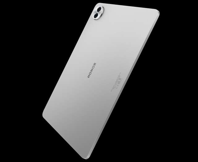
Questo articolo contiene link di affiliazione: acquisti o ordini effettuati tramite tali link permetteranno al nostro sito di ricevere una commissione nel rispetto del codice etico. Le offerte potrebbero subire variazioni di prezzo dopo la pubblicazione..bmaff_error { display: none !important;}Honor Pad 10: nuovo tablet da 12 pollici
I nuovi Honor 400 hanno ovviamente attirato l’attenzione della stampa specializzata e degli utenti. Il produttore cinese ha svelato in sordina anche un tablet con caratteristiche molto interessanti. Honor Pad 10 ha uno schermo 2.5K da 12 pollici e un’enorme batteria. Può essere già acquistato in Italia.
Honor Pad 10: specifiche e prezzoHonor Pad 10 ha un telaio in alluminio corindone ad alta resistenza, uno spessore di 6,29 millimetri e un peso di 525 grammi, quindi è resistente, sottile e leggero. Lo schermo ha una diagonale di 12,1 pollici, risoluzione di 2560×1600 pixel e refresh rate fino a 120 Hz (60/90/120 Hz).
Integra un processore Snapdragon 7 Gen 3 (octa core con frequenza massima di 2,63 GHz), affiancato da 8 GB di RAM e 256 GB di storage. Queste sono le altre specifiche: fotocamere posteriore e frontale da 8 megapixel, connettività Wi-Fi 6 e Bluetooth 5.3, porta USB Type-C, sei altoparlanti e batteria da 10.100 mAh con supporto per la ricarica rapida da 35 Watt.
Il sistema operativo è MagicOS 9.0 basato su Android 15. Gli utenti potranno utilizzare diverse funzionalità AI per la produttività. AI Honor Notes trasforma il testo scritto in testo stampato, mentre Assistente AI Notes può generare riassunti di riunioni, lezioni e discussioni. È possibile inoltre registrare la voce e convertirla automaticamente in testo, anche con traduzione.
Il tablet viene offerto solo in grigio. Il prezzo è 349,90 euro. Aggiungendo solo 0,90 euro, gli utenti possono ricevere la tastiera Bluetooth o la stilo. Le spedizioni inizieranno dal 2 giugno.
Questo articolo contiene link di affiliazione: acquisti o ordini effettuati tramite tali link permetteranno al nostro sito di ricevere una commissione nel rispetto del codice etico. Le offerte potrebbero subire variazioni di prezzo dopo la pubblicazione..bmaff_error { display: none !important;}Videocamera intelligente Blink Mini Pan-Tilt: sicurezza smart scontata del 35%
Occuparsi (e preoccuparsi) della sicurezza in casa non significa solamente temere che i ladri provino a entrare. I rischi in casa possono essere diversi e possono riguardare anche il monitoraggio degli animali domestici o il controllo dei bambini che dormono nella propria cameretta mentre magari si è al PC o si guarda la TV per questo un dispositivo come la videocamera intelligente Blink Mini Pan-Tilt è indispensabile. Poterla acquistare a soli 25,99€ con il 35% di sconto è un’opportunità da cogliere al volo.
3 ragioni per scegliere la videocamera intelligente Blink Mini Pan-Tilt
- Controllo panoramico e inclinazione da remoto
- Video HD e rilevamento di movimento intelligente
- Audio bidirezionale + compatibilità con Alexa
35% di sconto sulla videocamera intelligente Blink Mini Pan-Tilt
Parla e ascolta da remoto con audio bidirezionale integratoIl primo elemento che credo sia importante della videocamera intelligente Blink Mini Pan-Tilt è il suo angolo di visualizzazione di 360°. L’obiettivo della videocamera, infatti, ruota completamente così da permetterti di guardare in ogni angolo della stanza (senza zone d’ombra) ed essere aggiornato in tempo reale in caso di movimenti o rumori sospetti.
A questo proposito la videocamera intelligente Blink Mini Pan-Tilt è un dispositivo intelligente perché riconosce rumori e movimenti sospetti e te li segnala immediatamente con notifica sul tuo smartphone.
E poi la Blink Mini Pan-Tilt supporta l’audio bidirezionale. In questo modo puoi non solo ascoltare in tempo reale cosa accade in una stanza, ma anche parlare. È una funzione molto utile, ad esempio quando usi la videocamera come baby monitor. Sei fuori con gli amici e tuo figlio si sveglia e vuole essere rassicurato? Puoi farlo in maniera semplice e sicura.
Ideale per chi…
- Vuole tenere d’occhio animali domestici o bambini
- Cerca una soluzione smart per la sicurezza domestica
- Desidera monitorare persone care a distanza
35% di sconto sulla videocamera intelligente Blink Mini Pan-Tilt
Un prodotto come la videocamera intelligente Blink Mini Pan-Tilt, a un prezzo così basso, è davvero un’occasione da non perdere. Un modo semplice, ma estremamente versatile, per avere un maggiore controllo sulla tua sicurezza e quella della tua casa e della tua famiglia. Acquista ora la videocamera intelligente Blink Mini Pan-Tilt a soli 25,99€.
Questo articolo contiene link di affiliazione: acquisti o ordini effettuati tramite tali link permetteranno al nostro sito di ricevere una commissione nel rispetto del codice etico. Le offerte potrebbero subire variazioni di prezzo dopo la pubblicazione..bmaff_error { display: none !important;}Basta con lo stress dei call center: eliminali con Incogni al 50% di sconto
Le telefonate indesiderate stanno diventando un vero e proprio incubo quotidiano. Promozioni aggressive, proposte di fornitori energetici, offerte di operatori telefonici: i call center sembrano non darti mai tregua. Ma c’è una soluzione semplice e automatica per liberarsene una volta per tutte: Incogni, lo strumento sviluppato da Surfshark per rimuovere i tuoi dati personali dai database delle aziende che li vendono o li usano per contattarti.
In questo momento, Incogni è disponibile con uno sconto del 50% su tutti i piani. Il piano annuale parte da 7,29€ al mese: è a tutti gli effetti una delle soluzioni più efficaci ed economiche per riprendere il controllo sulla propria privacy e dire addio alle chiamate moleste.
Come funziona IncogniIncogni agisce su un problema reale: la raccolta e la diffusione incontrollata dei dati personali da parte dei cosiddetti data broker, società che acquistano, incrociano e rivendono informazioni sensibili (tra cui numero di telefono, indirizzo, abitudini online e preferenze di consumo) a fini commerciali. Queste informazioni, spesso, finiscono proprio nelle mani dei call center.
Una volta iscritto, Incogni si occupa in automatico di contattare i data broker a tuo nome, invocando i diritti previsti dalle normative sulla protezione dei dati (come il GDPR in Europa o il CCPA negli Stati Uniti). Non appena riceve risposta, il tool verifica l’effettiva rimozione dei tuoi dati e ti aggiorna sullo stato delle richieste attraverso una dashboard intuitiva. In pratica, fa tutto il lavoro al posto tuo.
Tra le altre funzionalità:
- copertura di centinaia di data broker in continuo aggiornamento;
- processo 100% automatizzato, con la possibilità di monitorare in tempo reale ogni rimozione andata a buon fine;
- supporto legale integrato, basato sulle normative vigenti.
L’offerta è valida per un periodo limitato: se sei stanco di essere disturbato da numeri sconosciuti, è il momento giusto per fare un passo verso una vita digitale più tranquilla e riservata. Vai sul sito di Incogni e inizia a godere dei vantaggi di questo eccezionale servizio.
Questo articolo contiene link di affiliazione: acquisti o ordini effettuati tramite tali link permetteranno al nostro sito di ricevere una commissione nel rispetto del codice etico. Le offerte potrebbero subire variazioni di prezzo dopo la pubblicazione..bmaff_error { display: none !important;}Smart App Control migliora sicurezza e prestazioni
Microsoft ha spesso suggerito di passare a Windows 11 perché include funzionalità migliori per la sicurezza. Una di esse è Smart App Control, disponibile a partire dalla versione 22H2 del sistema operativo. L’azienda di Redmond ha illustrato i vantaggi rispetto ad un antivirus tradizionale.
Solo con installazione pulitaMicrosoft sottolinea che i tradizionali antivirus sono ottimi per rilevare file infetti che possono essere messi in quarantena o eliminati. Non sempre però possono garantire la protezione del sistema contro nuove o sofisticate minacce, ma è necessario installare gli aggiornamenti.
Smart App Control offre invece una protezione proattiva, rilevando il software infetto prima dell’esecuzione attraverso un confronto con il database delle app disponibile sul cloud. Viene in particolare verificata la validità della firma digitale. C’è solo un requisito fondamentale. Per sfruttare la funzionalità è necessaria l’installazione pulita, quindi non può essere attivata dopo l’upgrade da Windows 10 a Windows 11.
Oltre all’approccio proattivo c’è un altro vantaggio di Smart App Control sugli antivirus tradizionali. Dato che rileva le app prima dell’esecuzione non richiede una continua scansione di file e processi per la protezione in tempo reale. Ciò significa meno occupazione di risorse (CPU e RAM) e maggiori prestazioni.
In realtà sono stati segnalati casi (probabilmente isolati) in cui la funzionalità causa rallentamenti. Al momento non ci sono soluzioni diverse dalla disattivazione. Smart App Control è accessibile in Sicurezza Windows > Controllo delle app e del browser > Controllo intelligente delle app.
Server solo RAM con Surfshark VPN, ora a 2,19€ al mese
Surfshark conferma il suo ruolo da protagonista nel settore delle VPN, non solo per l’eccellente rapporto qualità-prezzo, ma anche per l’attenzione alla sicurezza degli utenti. Uno degli aspetti più interessanti riguarda infatti la tecnologia dei server solo RAM: tutti i server Surfshark operano esclusivamente su memoria volatile, il che significa che non esiste alcuna possibilità di archiviazione permanente dei dati.
Ad ogni riavvio, tutte le informazioni vengono automaticamente cancellate. Questo approccio, oltre a migliorare le performance, garantisce una maggiore tutela della privacy e impedisce eventuali fughe di dati sensibili.
E ora è possibile accedere a queste funzionalità avanzate a un prezzo davvero competitivo. L’offerta attuale di Surfshark consente infatti di sottoscrivere il piano Starter per soli 2,19€ al mese, grazie a uno sconto dell’86% sul prezzo standard. L’abbonamento copre un periodo di 24 mesi, ai quali si aggiungono 3 mesi extra gratuiti, per un totale di 27 mesi di protezione online completa.
Tutte le funzionalità principali di Surfshark VPNOltre alla struttura tecnica avanzata, Surfshark mette a disposizione un ricco pacchetto di funzionalità che la rendono una delle VPN più complete sul mercato:
- Connessioni illimitate: puoi usare Surfshark su tutti i tuoi dispositivi contemporaneamente, senza limiti;
- Kill switch automatico, che blocca il traffico internet in caso di disconnessione dalla VPN, evitando esposizioni accidentali;
- CleanWeb, il sistema integrato per bloccare pubblicità, malware e tentativi di phishing;
- Accesso a contenuti con restrizioni geografiche, utile per lo streaming di cataloghi esteri su piattaforme come Netflix, Disney+ o BBC iPlayer;
- Crittografia AES-256, lo standard più elevato per la protezione dei dati.
L’offerta è disponibile per un tempo limitato ed è ideale per chi cerca una VPN veloce, sicura e accessibile, con server ottimizzati, policy no-log e una delle migliori assistenze clienti del settore. Per approfittarne vai sul sito di Surfshark.
Questo articolo contiene link di affiliazione: acquisti o ordini effettuati tramite tali link permetteranno al nostro sito di ricevere una commissione nel rispetto del codice etico. Le offerte potrebbero subire variazioni di prezzo dopo la pubblicazione..bmaff_error { display: none !important;}Brave attacca DuckDuckGo e lo fa con un meme...
Di fronte a Google, che domina il mercato incontrastato, diversi motori di ricerca alternativi si stanno dividendo alcune quote di mercato. Ma invece di collaborare, si prendono in giro a vicenda, e quello che è ancora peggio, in pubblico.
Brave prende in giro DuckDuckGoDopo aver acquisito la tecnologia di Tailcat a marzo 2021, Brave ha lanciato il suo motore di ricerca in versione beta pubblica tre mesi dopo. Per due anni, l’azienda ha utilizzato le API di Microsoft Bing per circa il 7% delle query, ma da maggio 2023, il motore si è affidato interamente alla sua tecnologia proprietaria.
Su X, il team di Brave ha sottolineato questa distinzione affermando: “La maggior parte dei cosiddetti motori di ricerca ‘indipendenti’ in realtà ottengono i loro risultati dalle big tech. Brave utilizza il proprio indice di ricerca, quindi non vedrete gli stessi risultati di tutti gli altri“. Questo tweet, accompagnato da un meme, descrive il rivale DuckDuckGo come una semplice versione di Bing.
Most "independent" search engines are actually getting their results from Big Tech. Brave uses its own search index so you won’t see the same results you get everywhere else. pic.twitter.com/C4cfCixdlb
— Brave (@brave) May 25, 2025
Ma forse Brave non avrebbe dovuto farlo: alcuni utenti si sono affrettati a precisare che il browser Brave è basato sul progetto Chromium. La versione open source di Chrome è principalmente di proprietà di Google, un altro gigante tecnologico. E quindi, come la mettiamo? Per essere completamente indipendente, Brave avrebbe dovuto scrivere il proprio motore di rendering o unire le forze con Ladybird.
Brave è comunque in vantaggioIl fatto di utilizzare un proprio motore di ricerca, dà a Brave un un vantaggio rispetto ad altri motori alternativi. Non dipende, infatti, da aziende esterne per ottenere i risultati di ricerca.
Recentemente Microsoft ha chiuso l’accesso pubblico alle API di Bing. Questo è un problema per quei motori di ricerca alternativi che usano i risultati di Bing, proprio come DuckDuckGo. Ma l’azienda è tranquilla (per ora) perché ha un accordo privato e a lungo termine con Microsoft che gli consente di continuare a usare i risultati di Bing, nonostante la chiusura delle API.
Ma c’è un “ma”. Dipendere da un accordo privato significa che DuckDuckGo è vulnerabile. Se Microsoft decidesse in futuro di modificare i termini, alzare i costi o cambiare strategia, DuckDuckGo potrebbe trovarsi in difficoltà. In pratica, Brave ha costruito un’infrastruttura autonoma, mentre DuckDuckGo è ancora legato a Microsoft. E questa differenza rende Brave più solido e indipendente sul lungo periodo.
Questo articolo contiene link di affiliazione: acquisti o ordini effettuati tramite tali link permetteranno al nostro sito di ricevere una commissione nel rispetto del codice etico. Le offerte potrebbero subire variazioni di prezzo dopo la pubblicazione..bmaff_error { display: none !important;}Cialde Caffè Borbone ESE: solo 16 centesimi su eBay
Oggi è facile e conveniente bere un ottimo espresso napoletano a casa tua ogni volta che vuoi. Grazie alla Cialde Caffè Borbone Miscela Nera ESE 44mm costano solo 16 centesimi l’una. Cosa stai aspettando? Approfitta subito dell’offerta su eBay. Hai l’occasione perfetta per risparmiare senza rinunciare alla qualità.
Ordina le Cialde Borbone Miscela Nera
Miscela Nera offre un gusto intenso e un sapore marcato. Conosciuta per il suo carattere fermo, evoca la tipica tradizione del vero caffè napoletano. Non ci sono altre cialde buone così e, soprattutto, a questo prezzo conveniente. Frutto di una pregiata selezione di miscele, regala un espresso di grande corpo.
Vivi tutte le volte che vuoi un’esperienza ricca e cremosa come quella del bar. Queste cialde sono compatibili con tutte le macchine ESE 44mm come Bialetti Mokona, Faber Slot, Didiesse Frog e Didiesse Didi. La consegna gratuita è inclusa nella promozione e, raggiungendo 30 euro di spesa o più, puoi pagare in 3 rate a tasso zero.
Cialde Caffè Borbone Miscela Nera ESE: ottima sceltaLe Cialde Caffè Borbone Miscela Nera ESE 44mm sono un’ottima scelta per chi cerca un buon espresso, dal carattere deciso e dalla tazza cremosa. Al palato è vellutato e dell’aroma persistente. Acquistale subito a soli 16 centesimi l’una. L’offerta la trovi solo su eBay.
Ogni cialda viene confezionata singolarmente per regalare la stessa esperienza del chicco appena macinato che vivi nel bar. Ogni volta che scarti la tua cialda sentirai tutti i profumi del chicco appena tostato, per una sensazione avvolgente e cremosa già solo all’olfatto.
Ordina le Cialde Borbone Miscela Nera
Non sprecare questa incredibile occasione. Ordina ora le Cialde Miscela Nera a soli 0,16 centesimi! Le trovi solo ed esclusivamente su eBay. Consegna gratuita per tutti gli importi e rate a tasso zero per importi uguali o superiori a 30 euro.
Questo articolo contiene link di affiliazione: acquisti o ordini effettuati tramite tali link permetteranno al nostro sito di ricevere una commissione nel rispetto del codice etico. Le offerte potrebbero subire variazioni di prezzo dopo la pubblicazione..bmaff_error { display: none !important;}SCONTO RECORD sul tablet Xiaomi Pad 7 Pro da 11,2 pollici
Ti segnaliamo l’ottima offerta su eBay per Xiaomi Pad 7 Pro, il tablet di fascia alta che unisce design e prestazioni. È perfetto per lo streaming, ma anche per gestire più applicazioni in multitasking grazie al suo schermo in alta definizione. All’occorrenza può diventare un piccolo notebook per la produttività in movimento se abbinato a una tastiera Bluetooth.
Compra Xiaomi Pad 7 Pro in offerta
Il codice sconto per il tablet Xiaomi Pad 7 ProHa in dotazione un display 3.2K da 11,2 pollici con frequenza di aggiornamento da 144 Hz e risoluzione 3200×2136 pixel. Il cuore pulsante è invece costituito dal processore Snapdragon 8s Gen 3 di Qualcomm, affiancato da ben 12 GB di RAM e da 512 GB di memoria interna. I punti di forza non finiscono qui: ci sono la fotocamera posteriore da 50 megapixel, quella anteriore da 32 megapixel, la connettività Wi-Fi 7 alla massima velocità e la batteria da 8.850 mAh con autonomia elevata. Le dimensioni sono 251x173x6 millimetri, il peso è 500 grammi. Il sistema operativo è Android con personalizzazione HyperOS e accesso ai servizi di Google. Trovi altre informazioni in merito alle specifiche tecniche integrate e alle funzionalità supportate nella scheda del dispositivo.
Per sbloccare lo sconto e acquistare il tablet Xiaomi Pad 7 Pro al prezzo finale di 474 euro (invece di 599 euro come da listino) devi solo aggiungere il codice BRANDM25 nell’apposito campo prima di effettuare il pagamento. L’immagine qui sotto ti mostra come dare, è molto semplice. Attenzione: le unità in promozione sono poche e potrebbe andare sold out in breve tempo, se sei interessato ti consigliamo di approfittarne subito.
Compra Xiaomi Pad 7 Pro in offerta
La vendita è gestita dallo store ufficiale del marchio su eBay con all’attivo migliaia di recensioni positive ricevute dai clienti. Inoltre, la disponibilità è immediata con la spedizione gratis e la consegna prevista entro pochi giorni direttamente a casa.
Questo articolo contiene link di affiliazione: acquisti o ordini effettuati tramite tali link permetteranno al nostro sito di ricevere una commissione nel rispetto del codice etico. Le offerte potrebbero subire variazioni di prezzo dopo la pubblicazione..bmaff_error { display: none !important;}Meta AI userà i nostri dati di Facebook e Instagram: come opporsi
Dal 27 maggio Meta potrà usare i contenuti pubblici, i commenti, le foto e i video condivisi dagli utenti su Facebook e Instagram. Lo scopo è addestrare i suoi modelli AI, con il permesso della Commissione irlandese per la protezione dei dati (l’autorità competente per Meta in Europa). Meta è stata obbligata a migliorare la trasparenza del suo approccio, a semplificare il modulo di obiezione e a prorogare il termine per informare gli utenti.
Meta userà solo i contenuti resi pubblici dagli utenti per addestrare i suoi sistemi AI. Non verranno utilizzati invece i messaggi privati, le conversazioni tra amici o familiari, e i contenuti di account appartenenti a minori. Anche i messaggi di WhatsApp sono esclusi. Tuttavia, se s’interagisce con il chatbot AI su WhatsApp, il modo in cui si fa (quello che si scrive, le richieste che si fanno, ecc.) potrà essere usato per migliorare gli algoritmi.
Come rifiutare l’utilizzo dei propri dati e qual è la posta in gioco?Chiunque desideri opporsi all’utilizzo dei propri dati può farlo attraverso i centri privacy di Facebook, Instagram e WhatsApp. Lì troverà un modulo specifico. Basta compilarlo entro il 27 maggio perché la richiesta venga presa in considerazione.
- Modulo di opposizione per Facebook;
- Modulo di opposizione per Instagram;
- Modulo di opposizione per WhatsApp;
- Modulo di opposizione senza effettuare il login o avere un account.
Va precisato, che ci sono ancora delle questioni aperte, e non tutte le situazioni sono completamente regolamentate. Alcuni casi vengono valutati individualmente, caso per caso, dalle autorità europee. Per esempio, anche se un contenuto è legalmente pubblico, potrebbe comunque sollevare problemi di privacy.
Un caso tipico è quello di un adulto che pubblica la foto di un bambino, rendendola visibile a tutti. Anche se l’adulto ha il diritto di farlo, l’utilizzo di quella foto da parte dell’intelligenza artificiale di Meta potrebbe essere considerato problematico, soprattutto in termini di tutela dei minori.
Questo articolo contiene link di affiliazione: acquisti o ordini effettuati tramite tali link permetteranno al nostro sito di ricevere una commissione nel rispetto del codice etico. Le offerte potrebbero subire variazioni di prezzo dopo la pubblicazione..bmaff_error { display: none !important;}Xiaomi POCO F6 Pro: un top di gamma a prezzo entry level
Lo Xiaomi POCO F6 Pro è sempre stato uno smartphone furbo, perfetto per chi cerca un top di gamma a prezzo entry level. Oggi il suo prezzo è ancora più conveniente grazie a eBay e al suo Coupon in grado di regalarti un extra sconto del 15% prima del check out. Cosa stai aspettando? Acquistalo subito a soli 296 euro, invece di 629,90 euro!
Si tratta di un prezzo di favore che ottieni inserendo il Voucher BRANDM25. Trovi la casella per attivare questo super extra sconto alla pagina dei metodi di pagamento. Ovviamente ti consigliamo di fare tutto il più velocemente possibile perché le scorte potrebbero terminare da un momento all’altro e questo comporterebbe un sold out.
Inoltre, oggi puoi approfittare anche dell’ottima opportunità di acquistare questo gioiellino sfruttando il tasso zero messo a disposizione da PayPal e Klarna. Selezionando uno di questi due metodi di pagamento puoi decidere se pagare in 3 rate senza interessi.
Xiaomi POCO F6 Pro: potenza e versatilità a prezzo bassissimoGrazie allo Xiaomi POCO F6 Pro ti assicuri uno smartphone potente e versatile a un prezzo bassissimo. Dotato di 12GB di RAM, questo telefono è in grado di assicurare prestazioni e fluidità da top di gamma. Con 512GB di ROM hai tantissimo spazio di archiviazione per app, giochi e contenuti multimediali. Acquistalo a prezzo da scaffale a soli 296 euro con BRANDM25.
Uno dei suoi punti di forza è il processore. Nonostante il suo prezzo economico, monta un Qualcomm Snapdragon 8 Gen 2 che fornisce una potenza eccellente. Inoltre, grazie alla HyperCharge a 120W in un attimo la batteria passa da 0 a 100. La tripla fotocamera da 50 MP con OIS scatta foto eccellenti.
Guarda il mondo che ami da un display AMOLED Flow WQHD+ da 120Hz, per colori brillanti, dettagli speciali e tanta fluidità. Ordina ora il tuo POCO F6 Pro a soli 296 euro, invece di 629,90 euro!
Questo articolo contiene link di affiliazione: acquisti o ordini effettuati tramite tali link permetteranno al nostro sito di ricevere una commissione nel rispetto del codice etico. Le offerte potrebbero subire variazioni di prezzo dopo la pubblicazione..bmaff_error { display: none !important;}Smart TV Android TCL da 32” in offerta a meno di 150€
Non hai una smart TV o la televisione della camera da letto, della sala hobby o della seconda casa è ancora un dispositivo di vecchia generazione? Con l’offerta di oggi su eBay hai la possibilità di acquistare la smart TV TCL Serie S54 con il 23% di sconto. Approfitta ora dell’offerta.
3 ragioni per scegliere la smart TV TCL Serie S54
- Intrattenimento smart a portata di mano
- Immagini vivide con HDR e colori realistici
- Wi-Fi integrato e connettività completa
23% di sconto sulla smart TV TCL Serie S54
La smart TV perfetta per ogni stanza della tua casaIl bello di questi dispositivi non è solo nella dimensione tecnologica, ma anche in quella estetica. La smart TV TCL Serie S54 è infatti una di quelle televisioni sottili e con un design elegante senza bordi che oltre a restituirti una visione migliore, contribuisce ad arredare in modo sobrio e originale ogni stanza della tua casa.
Dal punto di vista tecnologico puoi contare non solo sul sistema operativo Android TV, ma anche sull’integrazione con Google Home e il supporto a Google Assistant per gestire la tua televisione anche con la voce. Ma l’aspetto più interessante della smart TV TCL Serie S54 è che ha una risoluzione video HD con colori vividi, dettagli definiti e contrasti migliorati. Anche l’audio non è da meno con la tecnologia Dolby Audio che ti regala suoni chiari, ricchi e potenti.
Inoltre puoi decidere di ascoltare l’audio sia dalla TV che dalle cuffie, così da non perderti nulla mentre magari sei in cucina e il resto della famiglia è in soggiorno davanti alla televisione.
Ideale per chi…
- Vuole una seconda TV per cucina o camera da letto
- Cerca una TV semplice e intuitiva per tutta la famiglia
- Vuole portare lo streaming ovunque
23% di sconto sulla smart TV TCL Serie S54
A questo prezzo, 146,99€ con il 23% di sconto, l’acquisto della smart TV TCL Serie S54 è una vera occasione da non perdere.
Questo articolo contiene link di affiliazione: acquisti o ordini effettuati tramite tali link permetteranno al nostro sito di ricevere una commissione nel rispetto del codice etico. Le offerte potrebbero subire variazioni di prezzo dopo la pubblicazione..bmaff_error { display: none !important;}Mozilla Firefox: barra degli indirizzi più smart
Mozilla ha rilasciato Firefox 137 per desktop (Windows, macOS e Linux) il 1 aprile. Una delle novità principali riguarda la barra degli indirizzi. Un post pubblicato sul blog ufficiale descrive in dettaglio le varie funzionalità.
Barra degli indirizzi più semplice e smartLa prima funzionalità si chiama Unified Search Button. Il pulsante visibile alla sinistra della barra degli indirizzi permette di accedere all’elenco dei motori di ricerca e delle modalità di ricerca (segnalibri, cronologia, schede aperte, scorciatoie). È presente anche il link alla relativa pagina delle impostazioni.
Gli utenti noteranno inoltre che la query di ricerca rimane visibile nella barra degli indirizzi (persistenza) e non viene sostituita dall’URL del motore di ricerca. Ciò permette di usare la stessa query o di modificarla facilmente. Molto utile anche la funzionalità Intuitive Search Keywords. Consente di accedere alle modalità di ricerca con keyword descrittive, ad esempio @bookmarks, @tabs o @history.
La barra degli indirizzi supporta inoltre le azioni. È possibile eseguire rapidamente varie attività, come visualizzare gli add-on, cancellare la cronologia e riavviare Firefox. All’interno dei suggerimenti di ricerca sono inoltre mostrati i pulsanti “Cerca con…” e “Passa alla scheda”.
L’ultima funzionalità riguarda la sicurezza. Nella barra degli indirizzi viene mostrato più chiaramente che il sito non è sicuro perché utilizza il protocollo HTTP. Se invece il sito è sicuro perché usa HTTPS non verrà mostrato https:// all’inizio dell’URL. Alcune novità non erano ancora incluse in Firefox 137. Ora sono tutte disponibili con Firefox 138.
Questo articolo contiene link di affiliazione: acquisti o ordini effettuati tramite tali link permetteranno al nostro sito di ricevere una commissione nel rispetto del codice etico. Le offerte potrebbero subire variazioni di prezzo dopo la pubblicazione..bmaff_error { display: none !important;}ACEMAGIC V1 a 149€: così il Mini PC è un MUST HAVE
Design e potenza di calcolo si fondono in ACEMAGIC V1. Non lasciarti sfuggire l’offerta a tempo su Amazon disponibile in questo momento e metti il Mini PC sulla tua scrivania. Elegante e compatto, è adatto alla produttività, ma non solo, anche alla navigazione online, allo studio e all’intrattenimento multimediale nel tempo libero. Se lo acquisti ora arriverà a casa tua entro un paio di giorni al massimo.
ACEMAGIC V1: le caratteristiche del Mini PCIntegra il processore Intel N150 di ultima generazione con architettura Twin Lake e chip grafico Intel UHD con supporto alla risoluzione 4K e possibilità di collegare più monitor in contemporanea. Ci sono poi 8 GB di RAM, SSD da 256 GB per lo storage e il sistema operativo Windows 11 Pro preinstallato. Completano la dotazione i moduli Wi-Fi dual band e Bluetooth, quattro porte USB-A, una Ethernet, il jack audio e le uscite video HDMI e DisplayPort. Scopri di più nella descrizione completa.
Grazie all’offerta a tempo in corso (non sappiamo fino a quando andrà avanti) hai la possibilità di acquistare ACEMAGIC V1 al prezzo finale di soli 149,90 euro. Inoltre, se vuoi acquistare due unità del Mini PC, applicando il codice promozionale I2CD4T9D che trovi nella scheda dedicata puoi ottenere un ulteriore sconto del 5% sulla spesa finale.
C’è la spedizione gratis a carico di Amazon: compralo adesso per riceverlo entro un paio di giorni al massimo. Il voto medio assegnato dalle recensioni pubblicate dai clienti dell’e-commerce è pari a 4,5/5 stelle. Per l’eventuale restituzione con rimborso avrai due settimane dal ricevimento.
Questo articolo contiene link di affiliazione: acquisti o ordini effettuati tramite tali link permetteranno al nostro sito di ricevere una commissione nel rispetto del codice etico. Le offerte potrebbero subire variazioni di prezzo dopo la pubblicazione..bmaff_error { display: none !important;}Streaming senza blocchi regionali con EspressVPN al 61% di sconto
Oggi è possibile accedere a uno streaming senza blocchi regionali grazie a ExpressVPN, la VPN completa in grado di garantirti una connessione senza limitazioni né censure. Attiva l’abbonamento in offerta speciale al 61% di sconto! In regalo ottieni anche 4 mesi extra gratis. Si tratta di un’ottima opportunità di risparmio, senza rinunciare a nulla.
ExpressVPN è dotata di server posizionati in 105 paesi di tutto il mondo. Questo ti permette di cambiare il tuo Indirizzo IP e apparire in posizione diverse in tutto il mondo, dal Canada alla Cambogia con un semplice tap sul tuo dispositivo. Grazie a questa possibilità non solo ottieni tanta sicurezza, ma anche la possibilità di accedere ai contenuti online disponibili solo in alcuni paesi.
Inoltre, se ti trovi all’estero e vuoi accedere alle tue piattaforme streaming italiane senza blocchi regionali dovrai figurare in Italia anche se ti trovi fuori dal paese. Selezionando un server italiano sarà possibile mostrare alla piattaforma di streaming che ti stai collegando dall’Italia, anche se ti trovi in tutt’altra paese.
ExpressVPN: non solo streaming senza blocchi regionaliExpressVPN non è solo la soluzione a uno streaming senza blocchi regionali. Grazie a questa VPN il tuo streaming senza buffering diventa realtà. Potrai dire addio ai fastidiosi rallentamenti che rovinano la visione di un film o, peggio ancora, di un evento sportivo in diretta. Attiva l’abbonamento in offerta speciale al 61% di sconto! In regalo ottieni anche 4 mesi extra gratis.
Grazie ai suoi server ottieni una velocità eccezionale. Maggiore velocità e affidabilità superiori sono assicurate da Lightway, il protocollo VPN pionieristico disponibile solo con ExpressVPN. Aggiungi anche massima sicurezza e privacy online e tantissime funzionalità premium, incluso anche il gestore di password e il blocco degli annunci. Non perdere questa occasione, afferra adesso sicurezza, privacy e ottimizzazione.
Questo articolo contiene link di affiliazione: acquisti o ordini effettuati tramite tali link permetteranno al nostro sito di ricevere una commissione nel rispetto del codice etico. Le offerte potrebbero subire variazioni di prezzo dopo la pubblicazione..bmaff_error { display: none !important;}Mercato indossabili: Xiaomi batte Apple Watch
Apple Watch è stato per lungo tempo il re indiscusso del mercato indossabili, ma a quanto pare le cose sono cambiate. Infatti, secondo un nuovo report della società di analisi Canalys, lo smartwatch di Apple è passato in seconda posizione nel primo trimestre del 2025 e adesso ad occupare il primo posto c’è il Redmi Band 5 di Xiaomi.
Mercato indossabili: Xiaomi ha superato AppleIl mercato globale dei dispositivi indossabili ha visto una crescita del 13% anno su anno nel primo trimestre del 2025, raggiungendo un conteggio totale di spedizioni di 46,6 milioni di unità.
In merito a Xiaomi, la società ha aumentato le sue spedizioni da 6,1 milioni di unità nel Q1 2024 a 8,7 milioni di unità nel Q1 2025, registrando una crescita annuale del 44% e la più alta quota di mercato del 19%. Apple Watch ha registrato una crescita annua del 5% e una quota di mercato del 16% dopo aver aumentato le sue spedizioni da 7,2 milioni a 7,6 milioni.
Questa è la prima volta dal 2021 che il gigante tecnologico cinese ha raggiunto questo risultato. Uno dei suoi punti di forza è che Xiaomi ha investito in aggiornamenti del design, migliore integrazione di HyperOS e funzionalità avanzate per la sua Mi Band e Redmi Watch Series, portandoli a segmenti di prezzo più bassi.
Apple ha avuto un primo trimestre conservativo e ci si aspetta che riacquisti lo slancio nella seconda metà dell’anno con un grande aggiornamento del portafoglio, considerando anche il fatto che il 2025 segna dieci anni dal lancio del primo modello di Apple Watch.
Report precedenti suggeriscono altresì che Apple Watch ha faticato a tenere il passo con i suoi numeri di spedizione negli ultimi trimestri. A contribuire sarebbero stati vari fattori, tra cui la mancanza di Apple Watch Ultra 3 e Apple Watch SE e il minor numero di aggiornamenti.
Questo articolo contiene link di affiliazione: acquisti o ordini effettuati tramite tali link permetteranno al nostro sito di ricevere una commissione nel rispetto del codice etico. Le offerte potrebbero subire variazioni di prezzo dopo la pubblicazione..bmaff_error { display: none !important;}